Back to Case Studies
Making Prototypes Accessible to Stakeholders
Company
Sky Betting & Gaming
Role
Product Designer
Company
UX Hub
Back to Case Studies
Company
Sky Betting & Gaming
Role
Product Designer
Company
UX Hub
The Problem
As a product design team within a large organisation, we encountered challenges not only in gathering timely and constructive feedback from stakeholders but also giving visibility across the various functions. This often led to delays in the design process and misalignment on project goals.
We could share work via a multitude of ways to receive feedback already however stakeholders often lacked context or detail so feedback was often low value. Engagement was often low and for designers it was seen as a large overhead.
Prototypes were best viewed within the Figma app. They would give the best experience, better than links open in web views. This was also a problem as many stakeholder saw this as a barrier – downloading the app and creating a login. So often stakeholders weren’t viewing the prototypes in the best way.
We needed a way to give stakeholders across the business something more engaging and enable them better access to work while reducing the overhead for designers.
The Opportunity
Designers were often asked to share static visuals of their work which of course wouldn’t communicate the interactions with enough clarity and context, it was also creating a large overhead on designers and increasingly creating frustration with senior leadership because they weren’t getting clarity of what design teams were working on.
Prototype links could be shared via Slack or screen shared via Zoom but stakeholders but could still lack context as they would be looking at a device mockup and not physically holding the device in their hands, something I believe is often missed but imperative to testing mobile experiences.
Originally an idea for a device testing hub had stemmed from an accessibility work stream I was involved in where would could demonstrate to stakeholders various accessibility tools
The Problem
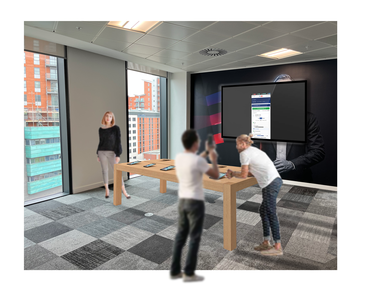
The idea was to build a hub with a range of devices to enable people to ‘pick up and play’. No barriers to testing Figma prototypes
The Problem
The idea was to build a hub with a range of devices to enable people to ‘pick up and play’. No barriers to testing Figma prototypes
The Problem
The idea was to build a hub with a range of devices to enable people to ‘pick up and play’. No barriers to testing Figma prototypes
The Problem
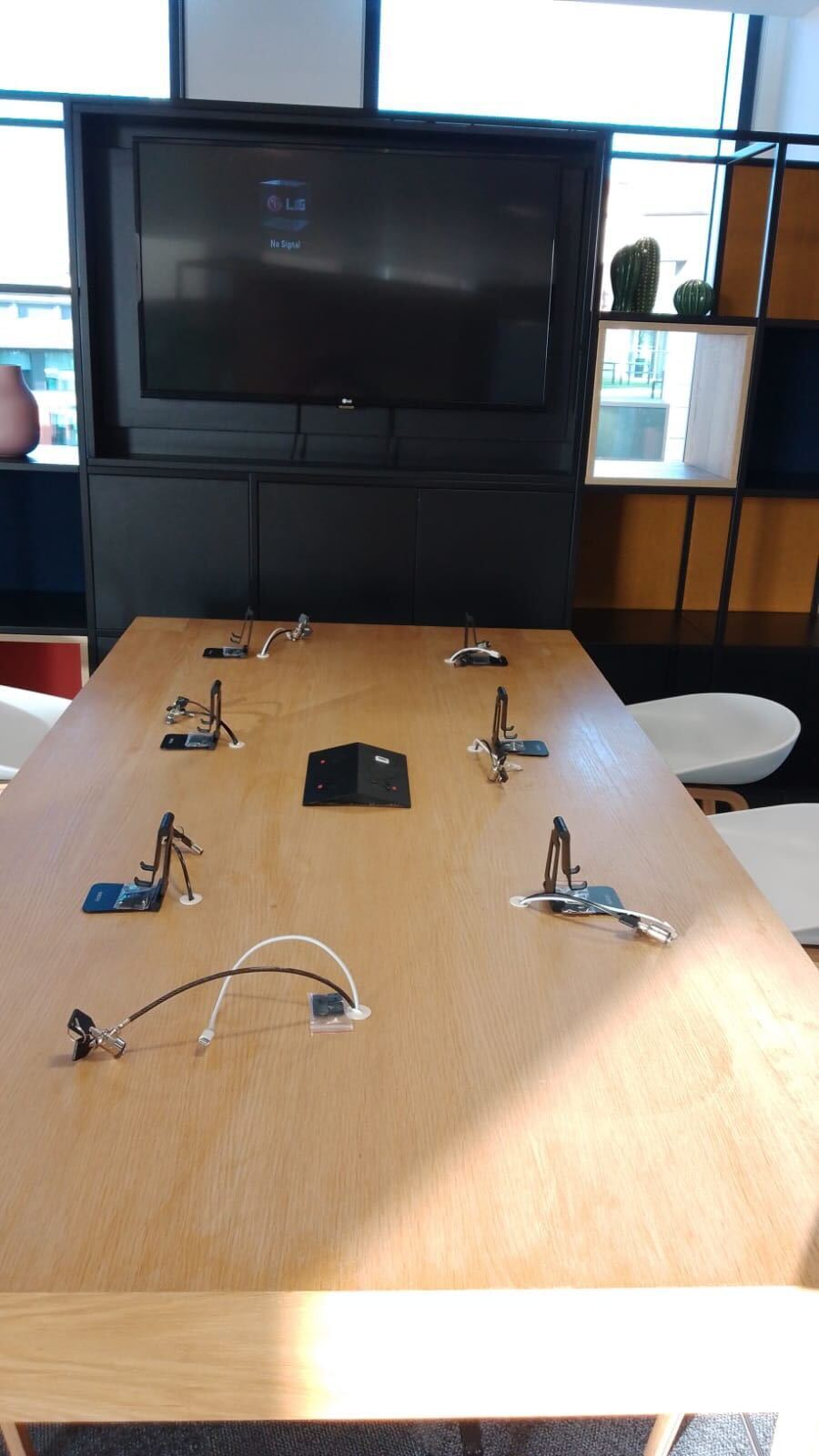
The first version of the UX Hub was some basic phone stands and locks. We created a template splash screen that could be used at the start of prototypes to inform users what the prototype task was and how to restart the prototype for the next user.
It worked to some degree, however it soon became clear the equipment wasn’t good enough. One of the requirements was the devices had to be physically secured to the bench, our low cost solution wasn’t very secure and overall it just looked very DIY. There were cables everywhere and something unexpected was that people wouldn’t put the phones back in the stands so it didn’t look tidy or welcoming.
It was also lacking in some visual cues what the space was, how to engage with it. We’d already had the idea to utilise the monitor and add some signage so I got some additional support from Flutter’s internal creative team. I briefed in a brand identity project, we wanted a logo and assets that we could use to advertise what’s on at the UX Hub, way finding signage and menu cards so we could explain each device model and the prototypes that were being shown that day. It also meant I could focus on getting the devices stands and locks upgraded.
The Problem
The first version of the UX Hub was some basic phone stands and locks. We created a template splash screen that could be used at the start of prototypes to inform users what the prototype task was and how to restart the prototype for the next user.
It worked to some degree, however it soon became clear the equipment wasn’t good enough. One of the requirements was the devices had to be physically secured to the bench, our low cost solution wasn’t very secure and overall it just looked very DIY. There were cables everywhere and something unexpected was that people wouldn’t put the phones back in the stands so it didn’t look tidy or welcoming.
The Problem
The idea was to build a hub with a range of devices to enable people to ‘pick up and play’. No barriers to testing Figma prototypes
The Problem
The idea was to build a hub with a range of devices to enable people to ‘pick up and play’. No barriers to testing Figma prototypes
The Problem
The idea was to build a hub with a range of devices to enable people to ‘pick up and play’. No barriers to testing Figma prototypes
Memory Issues
The idea was to build a hub with a range of devices to enable people to ‘pick up and play’. No barriers to testing Figma prototypes
Designer Uptake
The idea was to build a hub with a range of devices to enable people to ‘pick up and play’. No barriers to testing Figma prototypes
Unintended Use
The idea was to build a hub with a range of devices to enable people to ‘pick up and play’. No barriers to testing Figma prototypes
The Problem
The idea was to build a hub with a range of devices to enable people to ‘pick up and play’. No barriers to testing Figma prototypes
Back to Case Studies
Company
Sky Betting & Gaming
Role
Product Designer
Company
UX Hub
The Problem
As a product design team within a large organisation, we encountered challenges not only in gathering timely and constructive feedback from stakeholders but also giving visibility across the various functions. This often led to delays in the design process and misalignment on project goals.
We could share work via a multitude of ways to receive feedback already however stakeholders often lacked context or detail so feedback was often low value. Engagement was often low and for designers it was seen as a large overhead.
Prototypes were best viewed within the Figma app. They would give the best experience, better than links open in web views. This was also a problem as many stakeholder saw this as a barrier – downloading the app and creating a login. So often stakeholders weren’t viewing the prototypes in the best way.
We needed a way to give stakeholders across the business something more engaging and enable them better access to work while reducing the overhead for designers.
The Opportunity
Designers were often asked to share static visuals of their work which of course wouldn’t communicate the interactions with enough clarity and context, it was also creating a large overhead on designers and increasingly creating frustration with senior leadership because they weren’t getting clarity of what design teams were working on.
Prototype links could be shared via Slack or screen shared via Zoom but stakeholders but could still lack context as they would be looking at a device mockup and not physically holding the device in their hands, something I believe is often missed but imperative to testing mobile experiences.
Originally an idea for a device testing hub had stemmed from an accessibility work stream I was involved in where would could demonstrate to stakeholders various accessibility tools
Pick Up & Play
The idea was to create a hub with a range of devices that the design and UXR team can take ownership of. This would enable us better control of how we communicate our work. We could run the Figma app and break down the barriers for stakeholders when design teams want to share prototype links. Stakeholders could ‘pick up and play’ there was no need to request links, the work was available in the office on demand.
Business Case & Scope
I put together a business case and took it to our Product Director to request a budget for buying equipment. She set up a meeting with the Sky Bet CEO. I pitched the problem, opportunity and my intended solution along with costings and what the future scope could be. It was successful. With the budget secured I set about planning how we would execute. I wanted to generate some excitement amongst the design and research teams hoping that I could get representation from Gaming, Research and Customer. I would represent the Sports design team. I already had a few ideas that could expand it beyond a place to share prototypes and broadening the working group enabled us to really think about what it could be beyond my initial ideas. We discussed branding the hub, using it for labs, feature launches, product demos, group UATs and more! We made a plan to start small and iterate quickly.
Building the Hub
One of the biggest challenges was finding the right people I needed to make things happen. Flutter employs thousands of people across the UK and Ireland alone. It took a lot longer than I expected. Eventually I found the support I needed through IT Support teams, Security teams, Procurement and our facilities team, Workspace.
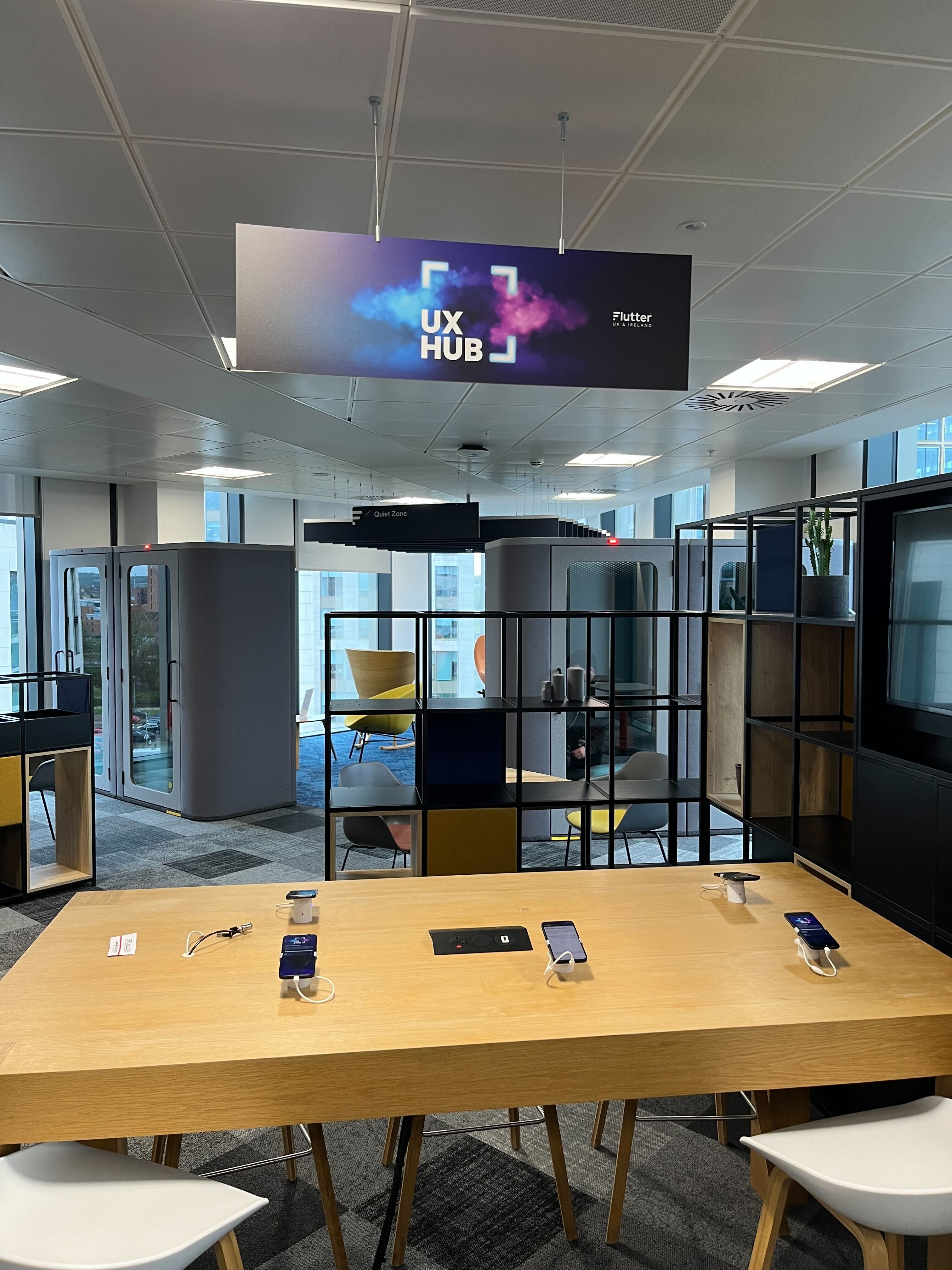
It became a big overhead and at one point almost seemed like it wouldn’t happen, the working group commitment was challenging, it was down to me to keep momentum and motivation high. I decided to seek more support so briefed in Flutter’s creative team to develop an internal brand with an ident under the name of UX Hub. A name designers and researchers generated together. The UX hub
started to feel real, it was a much needed boost.
Branding, signage & the UX Hub UI
Wayfinding, bench device card signage, UI design and linking prototypes
Iteration One
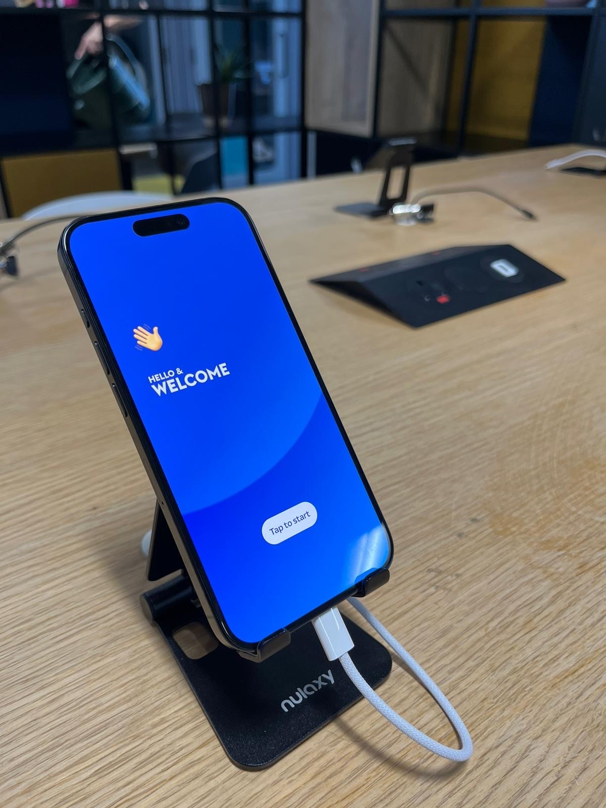
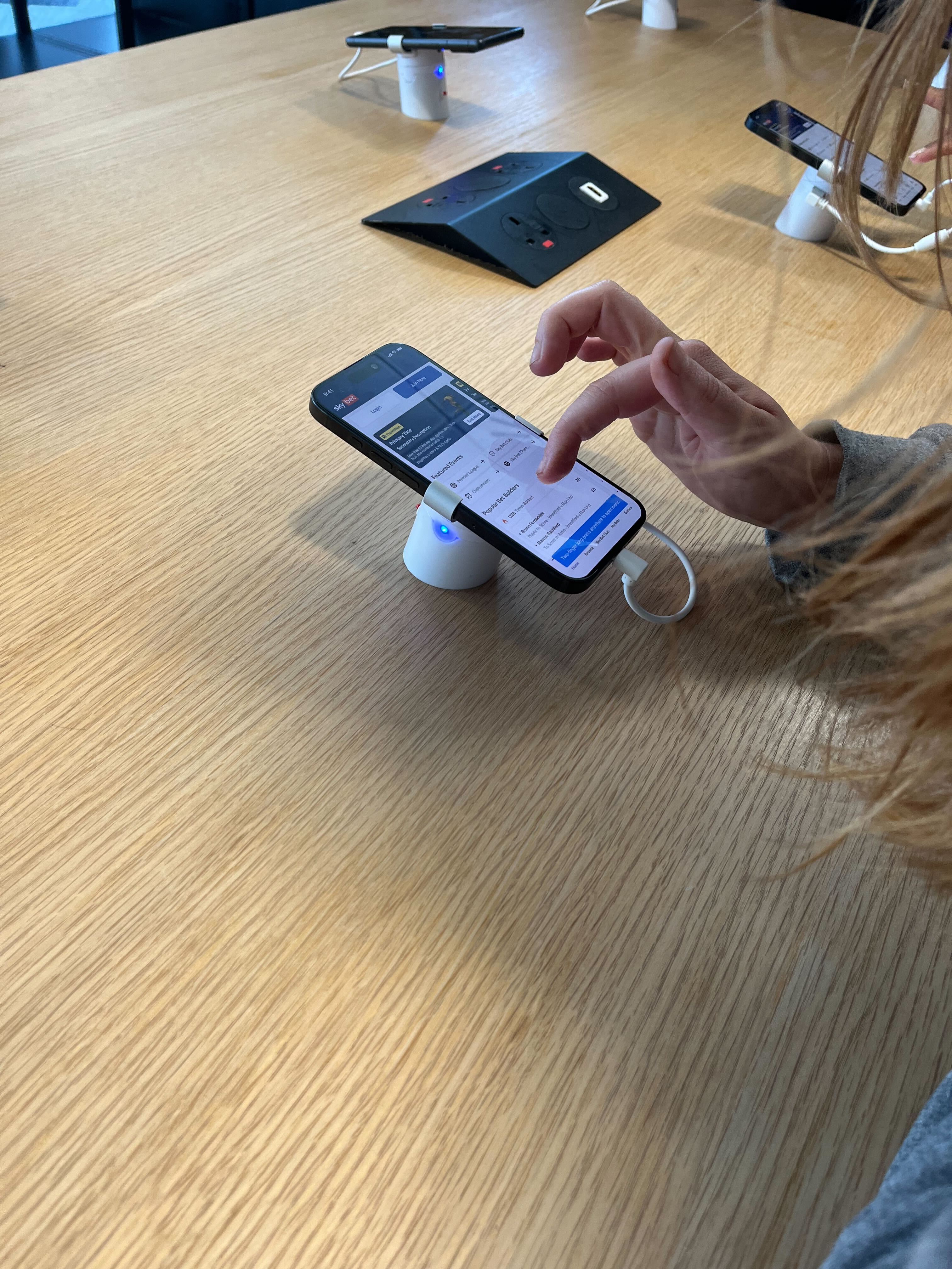
The first version of the UX Hub was some basic phone stands and locks. We created a template splash screen that could be used at the start of prototypes to inform users what the prototype task was and how to restart the prototype for the next user.
It worked to some degree, however it soon became clear the equipment wasn’t good enough. One of the requirements was the devices had to be physically secured to the bench, our low cost solution wasn’t very secure and overall it just looked very DIY. There were cables everywhere and something unexpected was that people wouldn’t put the phones back in the stands so it didn’t look tidy or welcoming.
It was also lacking in some visual cues what the space was, how to engage with it. We’d already had the idea to utilise the monitor and add some signage so I got some additional support from Flutter’s internal creative team. I briefed in a brand identity project, we wanted a logo and assets that we could use to advertise what’s on at the UX Hub, way finding signage and menu cards so we could explain each device model and the prototypes that were being shown that day. It also meant I could focus on getting the devices stands and locks upgraded.
Iteration Two
The first version of the UX Hub was some basic phone stands and locks. We created a template splash screen that could be used at the start of prototypes to inform users what the prototype task was and how to restart the prototype for the next user.
It worked to some degree, however it soon became clear the equipment wasn’t good enough. One of the requirements was the devices had to be physically secured to the bench, our low cost solution wasn’t very secure and overall it just looked very DIY. There were cables everywhere and something unexpected was that people wouldn’t put the phones back in the stands so it didn’t look tidy or welcoming.
The Problem
The idea was to build a hub with a range of devices to enable people to ‘pick up and play’. No barriers to testing Figma prototypes
The Problem
The idea was to build a hub with a range of devices to enable people to ‘pick up and play’. No barriers to testing Figma prototypes
The Problem
The idea was to build a hub with a range of devices to enable people to ‘pick up and play’. No barriers to testing Figma prototypes
The Problem
The idea was to build a hub with a range of devices to enable people to ‘pick up and play’. No barriers to testing Figma prototypes
The Problem
The idea was to build a hub with a range of devices to enable people to ‘pick up and play’. No barriers to testing Figma prototypes
The Problem
The idea was to build a hub with a range of devices to enable people to ‘pick up and play’. No barriers to testing Figma prototypes
The Problem
The idea was to build a hub with a range of devices to enable people to ‘pick up and play’. No barriers to testing Figma prototypes
Back to case studies
Company
Sky Betting & Gaming
Role
Product Designer
Project Name
UX Hub
The Problem
As a product design team within a large organisation, we encountered challenges not only in gathering timely and constructive feedback from stakeholders but also giving visibility across the various functions. This often led to delays in the design process and misalignment on project goals.
We could share work via a multitude of ways to receive feedback already however stakeholders often lacked context or detail so feedback was often low value. Engagement was often low and for designers it was seen as a large overhead.
Prototypes were best viewed within the Figma app. They would give the best experience, better than links open in web views. This was also a problem as many stakeholder saw this as a barrier – downloading the app and creating a login. So often stakeholders weren’t viewing the prototypes in the best way.
We needed a way to give stakeholders across the business something more engaging and enable them better access to work while reducing the overhead for designers.
The Opportunity
Designers were often asked to share static visuals of their work which of course wouldn’t communicate the interactions with enough clarity and context, it was also creating a large overhead on designers and increasingly creating frustration with senior leadership because they weren’t getting clarity of what design teams were working on.
Designers testing their work across a range of devices they otherwise wouldn’t have access to
Prototype links could be shared via Slack or screen shared via Zoom but stakeholders but could still lack context as they would be looking at a device mockup and not physically holding the device in their hands, something I believe is often missed but imperative to testing mobile experiences.
Originally an idea for a device testing hub had stemmed from an accessibility work stream I was involved in where would could demonstrate to stakeholders various accessibility tools
Pick Up & Play
The idea was to create a hub with a range of devices that the design and UXR team can take ownership of. This would enable us better control of how we communicate our work. We could run the Figma app and break down the barriers for stakeholders when design teams want to share prototype links. Stakeholders could ‘pick up and play’ there was no need to request links, the work was available in the office on demand.
Business Case & Scope
I put together a business case and took it to our Product Director to request a budget for buying equipment. She set up a meeting with the Sky Bet CEO. I pitched the problem, opportunity and my intended solution along with costings and what the future scope could be. It was successful. With the budget secured I set about planning how we would execute. I wanted to generate some excitement amongst the design and research teams hoping that I could get representation from Gaming, Research and Customer. I would represent the Sports design team. I already had a few ideas that could expand it beyond a place to share prototypes and broadening the working group enabled us to really think about what it could be beyond my initial ideas. We discussed branding the hub, using it for labs, feature launches, product demos, group UATs and more! We made a plan to start small and iterate quickly.
Building the Hub
One of the biggest challenges was finding the right people I needed to make things happen. Flutter employs thousands of people across the UK and Ireland alone. It took a lot longer than I expected. Eventually I found the support I needed through IT Support teams, Security teams, Procurement and our facilities team, Workspace.
We kept cost low and started with the MVP, it meant I didn’t have to wait for the long procurement process, get access to to creating deal sheets and adding a new business to our purchasing portal. Instead I could find what I needed and expense it, which gave me an increased impetus to keep cost down.
Iteration One
The first version of the UX Hub was some basic phone stands and locks. We created a template splash screen that could be used at the start of prototypes to inform users what the prototype task was and how to restart the prototype for the next user.
It worked to some degree, however it soon became clear the equipment wasn’t good enough. One of the requirements was the devices had to be physically secured to the bench, our low cost solution wasn’t very secure and overall it just looked very DIY. There were cables everywhere and something unexpected was that people wouldn’t put the phones back in the stands so it didn’t look tidy or welcoming.
It was also lacking in some visual cues what the space was, how to engage with it. We’d already had the idea to utilise the monitor and add some signage so I got some additional support from Flutter’s internal creative team. I briefed in a brand identity project, we wanted a logo and assets that we could use to advertise what’s on at the UX Hub, way finding signage and menu cards so we could explain each device model and the prototypes that were being shown that day. It also meant I could focus on getting the devices stands and locks upgraded.
Iteration Two
The upgraded podiums were secured with retractable cables and the signage helped to tie everything together. I evolved the UX Hub intereface taking assets from the Creative team and created a UX Hub dashboard to better enable users to self serve while at the hub. A Figma template was created so designers could also self serve and upload their prototypes to the UX Hub no matter which location they were in.
Launch
We wanted to show off the new space so we created an event inviting colleagues to come and interact, test, give feedback and of course in return we’d supply nibbles and we had a prize draw for those who attended.
It was a success, it was busy with people from all areas of the business covering all roles from junior to directors. It was exactly what we wanted. One of my concerns was only our friends would turn up to support but there were so many new faces. I was really conscious that it was something easily approachable but something I hadn’t really thought that much about was how quickly our networks would grow within the business.
Impact
It is really difficult to accurately measure anything objective because our old ways of communicating prototypes were not measured. Teams would gather their feedback independently which also made it difficult for the working group to gather a baseline and with the added overhead it didn’t really give us any value. The volume of feedback certainly feels noticeably greater. Ultimately, the whole project was about improving quality of feedback and visibility to stakeholders, it was never really about numbers or metrics.
As a design team we’re exposed to more of what’s going on across the business. We’re able to gather deeper insights from from stakeholders and demonstrate more accurately our ideas. It’s built stronger connections between teams and connections that never existed before.
Challenges
There’s been a few noticeable challenges since it’s launch. After the initial excitement died down it became evident we had some issues we needed to make improvements on:
Memory Issues
Originally I launched the UX Hub with an individual file linked to each device but this created confusion amongst designers and created a blocker to use. So I moved everything into one file so all devices ran from one file. It worked fine until lots of designers wanted to share things at the same time.
Designer Uptake
I noticed designers were sharing less. I wanted to understand why
Unintended Use
Aside from our colleagues using the UX Hub to charge their own devices we found that they were using the devices to browse the internet and other apps.
What Next?
The UX Hub has recently moved home and there’s been a resurgence in the working group. We still have improvements to make but the focus is...